The 2024 Color Trends That Are Making Waves, According to Designers
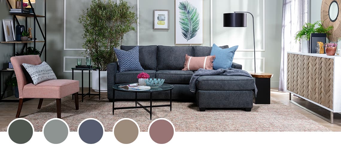
Let's discuss how colors can influence your psychological state and the unique psychological effects of the colors that are trending in 2024. This year, periwinkle blue, sage, olive, and bold earth tones are taking the lead in home decor trends. How can these colors be beautifully integrated into design trends and what are their unique psychological impacts?
The Top Four Color Trends in 2024
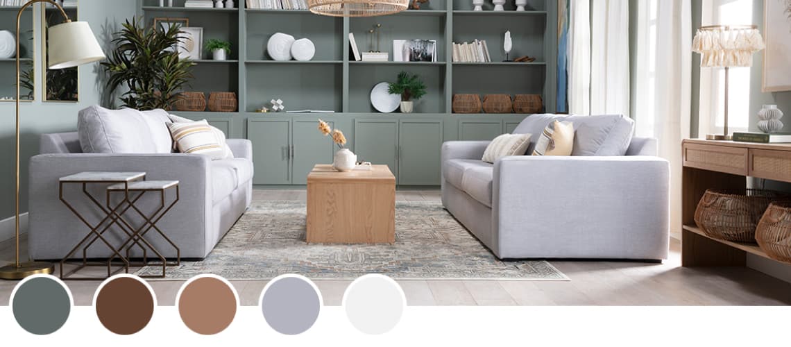
— Periwinkle —
What It Is: The color periwinkle is named after the periwinkle plant. It's a shade that's midway between blue and violet and belongs to the indigo family. It appears pale blue to the naked eye and is often mistaken for lavender.
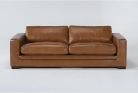
How a Designer Recommends Using Periwinkle in the Home: "Periwinkle is a great shade for a living room where its lighthearted serenity can be accentuated by brightly colored or white upholstery. It's also an exquisite choice to theme a girl's or couple's bedroom, where periwinkle wallpaper can be further ornamented or 'broken up' with tasteful wall tapestries." - Courtney Marquez, Living Spaces Interior Designer


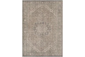
— Sage —
What It Is: Sage is a shade of green that has greyish or silver undertones and resembles the color of dry sage leaves. It's typically associated with fresh starts and new beginnings. It's a hue that signifies rebirth and progress in general.
Sage Green


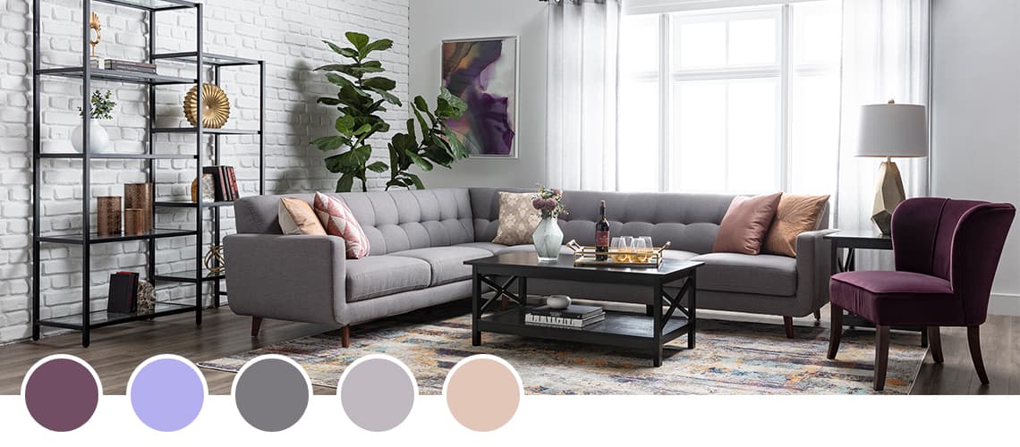
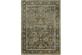
— Olive —
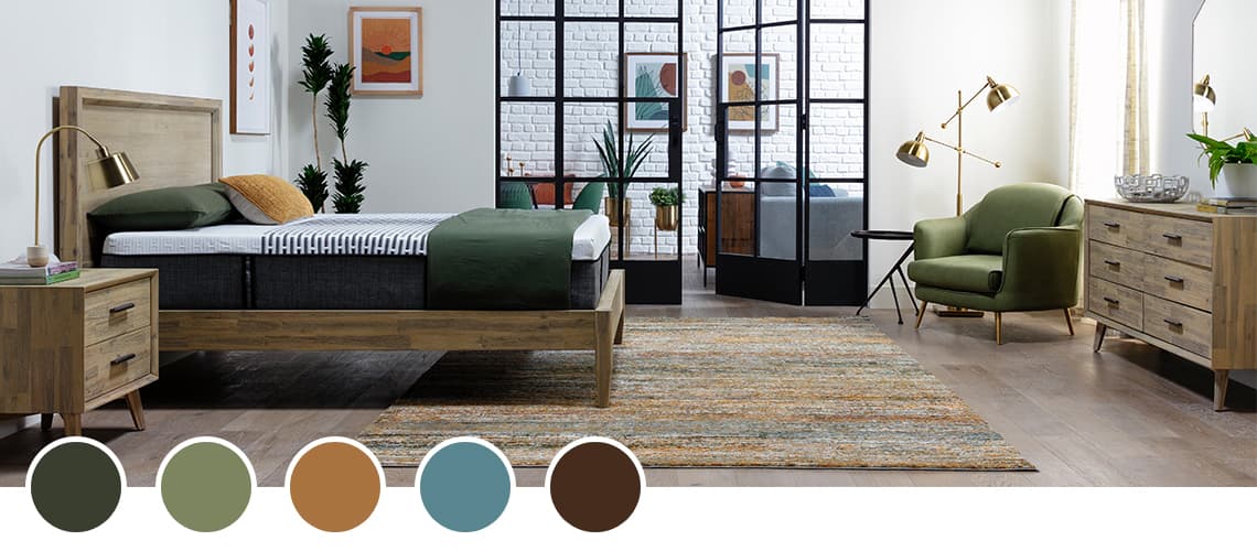
What It Is: Olive green is a friendly, warming, and vibrant shade of green that portrays elegance, nature, and homeliness. As with most shades of green, it's associated with nature, rebirth, and rejuvenation. It makes people feel relaxed and natural.
Olive


— Bold Earth Tones —
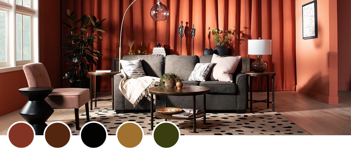
What It Is: Earth tones include all of the varying shades of green, yellow, brown, and orange. Together they form to create a strong sense of vibrance, youth, and energy. Burnt sienna, in particular, is a reddish-brown hue of orange that invokes a sense of rustic simplicity. It is widely popular in Hindu, Buddhist, and Yogic cultures. It is the most popular color for robes of spiritual men and monks among these cultures, and as a result, is often associated with ancient spirituality.
Brown


The Psychology Effect of Colors
Why does color have such a strong influence on our lives? What kind of impact does it have on our bodies and minds? While color perceptions are sometimes subjective, certain colors have universal significance. Some colors have the ability to encourage activity, change vibes, and even cause physiological responses. Certain colors have been associated with elevated blood pressure, metabolism, and eyestrain.
Chromotherapy is the use of colors as healing or therapy. It was practiced by several ancient cultures, including the ancient Egyptians and Chinese. "Light treatment" or "colorology" are alternate terms for chromotherapy. Colorology is still utilized in holistic treatment today.
While color may impact how we feel and act, experts have discovered that these effects are also influenced by personal, cultural, and environmental variables.
How to Add Color to a Room
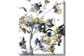
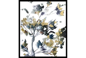
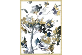
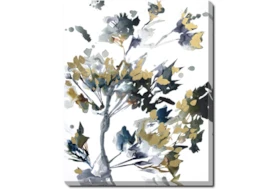
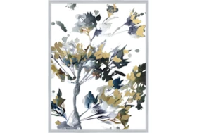
1. Wall Art
Add color in a cinch with a gallery of paintings filled with colorful brushstrokes, photographs of colorful objects or sketches on colorful backdrops. Whether it’s for a hallway, bedroom or any room – art makes the perfect way to perk up a blank canvas. Intensify your color choices with frames to match!
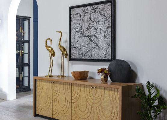
2. Sculptures
While we’re on the subject of art, let’s not forget stone, the ages-old medium used for artists’ statues and sculptures – and the modern take on the form by way of household sculptures and figurines. While you’re more likely to see neutrals when it comes to these design objects, colorful versions make a unique splash.
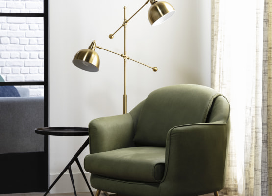
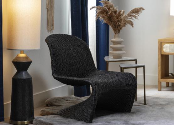
3. Lamps
Light is useless without color to illuminate, and the perfect place to start is in the lamp itself. Try bases with metallic colors like gold and silver for a subtler effect, or go bold and modern with bright primaries! To make sure you get the full effect of a lamp’s color at night, opt for an adjustable design that can be angled to shine on and around itself.
4. Faux Plants
Flowers pack high pigmentation per square inch, but they don’t last long and cost a pretty penny. Just as nice-looking are faux flowers, which will cost you less and brighten up a room with just as much energy-giving color. Go with a non-seasonal plant like ferns, which work year-round.
5. Accent Wall
Paint your vision: choose your favorite color and get to applying. The biggest thing in the room (and the thing you look at most in a room, whether subconsciously or not), the wall is your biggest asset for making a room feel brighter, and the right shade can boost your overall mood.
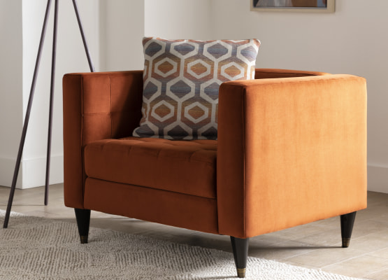
6. Accent Chair
A bold accent chair has a tremendous effect on a room’s color scheme. Choose a shade that fits your self-expression; you can even look into reupholstering options for freshening up an old chair. The great thing about colorful accent chairs is that actually sitting in one, you feel as though you’re enveloped in color – the most fun lounging experience, ever.
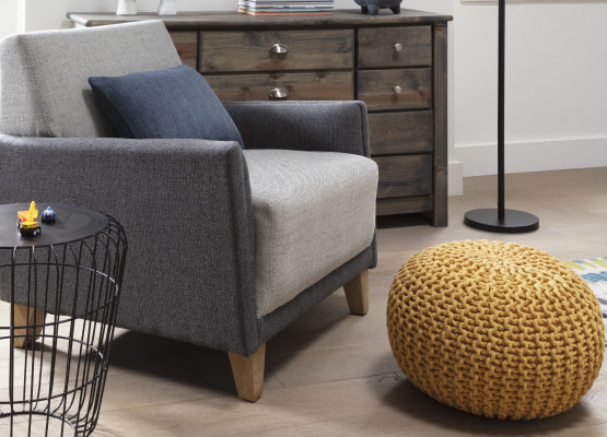
7. Poufs
This bright yellow pouf is making our color radars go off – in a good way. Yellow is associated with energy, life and sunshine, but poufs come in a range of colors and the choice is up to you. Try matching a pouf with a throw blanket (see next step) for cool coordination.
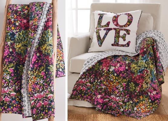
8. Throw Blanket
If you don’t think color can have a tangible effect, you’ve never accessorized with a raspberry blush throw blanket! Combined with the comfort of soft threads, color looks like it feels like cozy happiness. Throw over a sofa’s arm, chair’s arm or end of a bed for an easy splash of colorful comfort.
— More Great Articles —


Read the Latest


Editorial Disclaimer: Articles featuring tips and advice are intended for educational purposes and only as general recommendations. Always practice personal discretion when using and caring for furniture, decor and related items.