Blue, By State: Most Popular Shades (+ Decor Tips)
1. Stately Blues
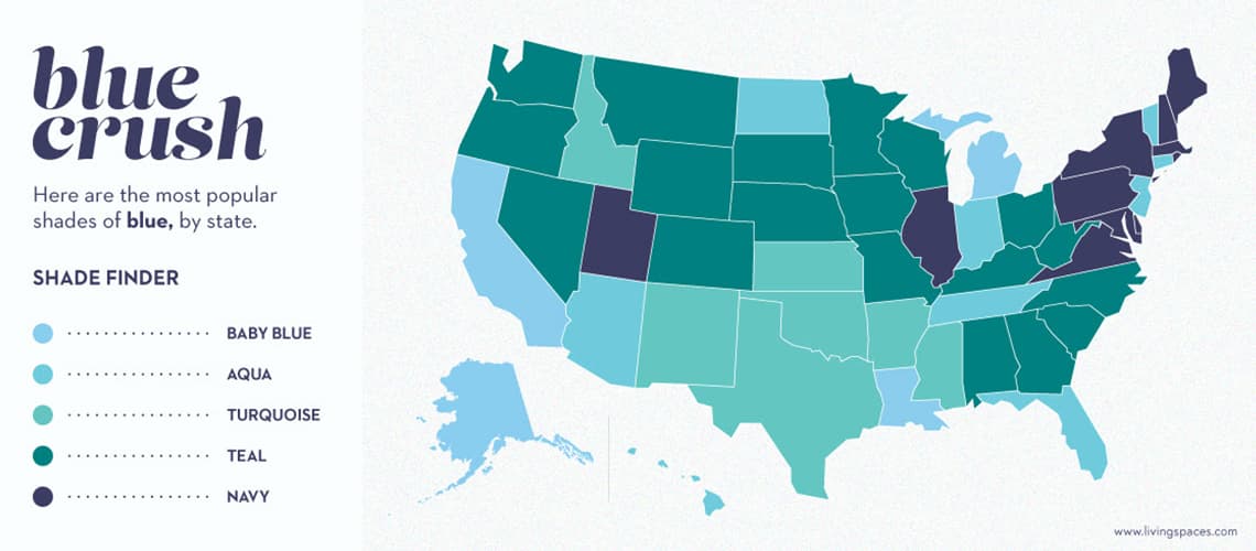
Here is each state’s favorite shade of blue – according to Google trends. See if your state shares your opinion – and which states tend to agree!
Teal
Navy Blue
Aqua
Turquoise
Baby Blue
The Google Trends data report used for the map* showed that teal was by far the most popular shade of blue in the U.S., representing 70% of search interest in the past year alone. Aqua was the first runner up, followed closely by Baby Blue. Above, you can see a visual representation of the data by state.
*Data taken from Google Trends on September 05, 2019
The data above interestingly shows that as a general trend, colder states gravitate toward darker blues and warmer states lighter blues. In particular, teal, which is simply blue warmed up with green, comprises a majority of the Midwest and its snow-prone terrain.The way we see it, this just proves the idea that not only color but color temperature can have a powerful effect on a room’s environment – cooling down or heating up as needed.
Singin’ the Blues: The Ultimate Guide to Popular Shades
|
Color |
Color Meaning |
|
Teal |
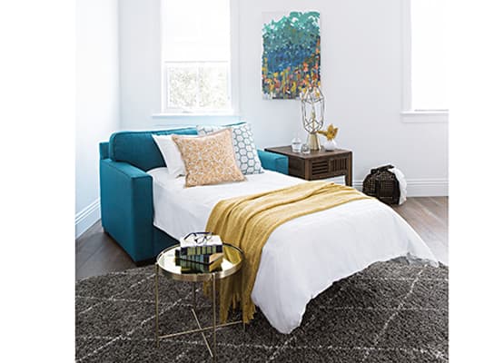
Similar to – but darker than – turquoise, teal is a mixture of blue and green. It is used to simultaneously warm up and cool down, and is often associated with the vibrant colors of summer.
|
|
Turquoise |
Like teal, turquoise is a mixture of blue and green. In design, turquoise is used for its light, chirpy properties and often connotes feelings of refreshment. |
|
Navy |
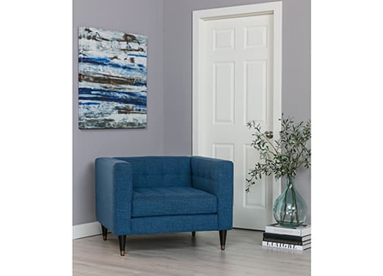
Dark, classic and grounding, navy is often associated with the U.S. Navy, and for good reason: both epitomize strength, discipline and are used in their respective spaces to guard and protect – emitting feelings of safety and calm. |
|
Baby |
If you’ve ever been to a baby boy’s baby shower, you probably saw this shade everywhere. Soft, fun and sweet, baby blue is nothing if not a celebration of joy. |
|
Aqua |
Imagine, for a moment, a lush green meadow around a blue lake on a spring day. Now, focus in on the way the light bounces off the water; see the sparkling droplets, reflecting blue sky and green meadow? That, precisely, is aqua. |
|
Cobalt |
Named after the eponymous compound (an alloy chemical found in the Earth’s natural iron which bears a dark, silvery undertone), cobalt is a rich, powerful shade of blue – brighter and bolder than its silvery counterpart.
|
|
Sapphire |
The bluest of blue gemstones – and only slightly darker than cobalt –, sapphire is rare in nature – but when it’s seen, it dazzles and inspires. |
|
Indigo |
Often considered the halfway point between blue and purple, indigo brings out the best of both colors. In the home, it brings complete balance – invoking the calming, cooling properties of blue and charming, regal properties of purple.
|
|
Azure |
Gearing towards the lighter end of the blue color spectrum, azure is nonetheless bright and powerful. Think of a summer sky on a gorgeous day, throw in some of that playful vacation ambiance – and you’ve got a good grasp on azure and the dazzling effect it can bestow!
|
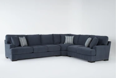
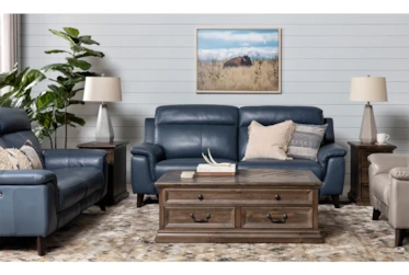
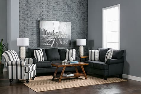
2. Dark Blue in Interior Design
Let’s get one thing straight: we love blue. In decor, in food (we’re looking at you, blueberries), in nature and in fashion, its energy makes us want to sing our hearts out with songs of life and love every time we come across it. (Okay, maybe that’s exaggerating a little bit…but you get the point.)
Color Meaning: All Shades of Blue
3. Light Blue in Interior Design
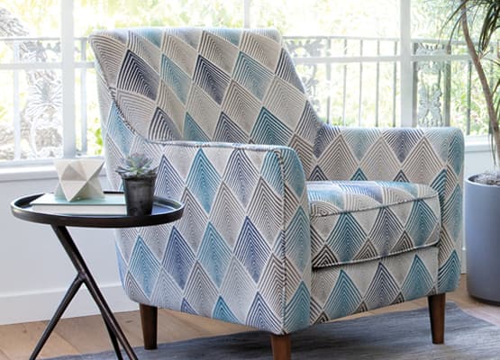
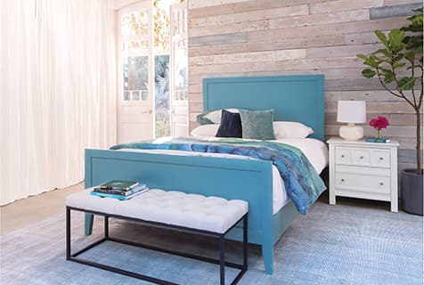
Light blue, such as shades of turquoise, teal, sky blue and robin’s egg, can refresh and invigorate any space. Light blue with warmer undertones (such as turquoise and teal) will make a beachy, tropical splash, while light blue with cooler undertones (such as sky blue and robin’s egg) add a softer, breezier elegance.
Featured Products
— More Great Articles —
Shades of Blue
Read the Latest
Editorial Disclaimer: Articles featuring tips and advice are intended for educational purposes and only as general recommendations. Always practice personal discretion when using and caring for furniture, decor and related items.
