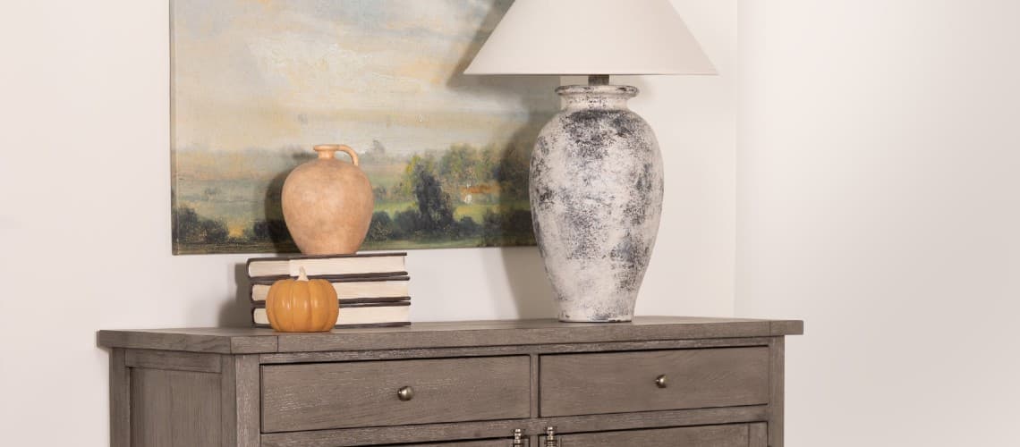
Decor Tips
Fall Color Palettes to Warm Up an Autumn Home
Seasons change, and it doesn’t just affect the weather. Moods wax and wane with the arrival of different times of year, and in the last season of the year, you can see it in anticipation. The excitement around approaching holidays, vacations and hosting out-of-town family can be enough to make anyone cheerful.
But the best part of this merriest time of year? The colors: outside, the world “blushes” with contentment as the leaves, flowers and even sunsets seem to turn various shades of red, auburn and orange. Bring out the most of everything autumn has to offer by taking a cue from its aesthetic: these fall color palettes are the cozy answer to the crisp weather outdoors – and just the thing needed to infuse your home living space with richness and warmth to match the season.
But the best part of this merriest time of year? The colors: outside, the world “blushes” with contentment as the leaves, flowers and even sunsets seem to turn various shades of red, auburn and orange. Bring out the most of everything autumn has to offer by taking a cue from its aesthetic: these fall color palettes are the cozy answer to the crisp weather outdoors – and just the thing needed to infuse your home living space with richness and warmth to match the season.
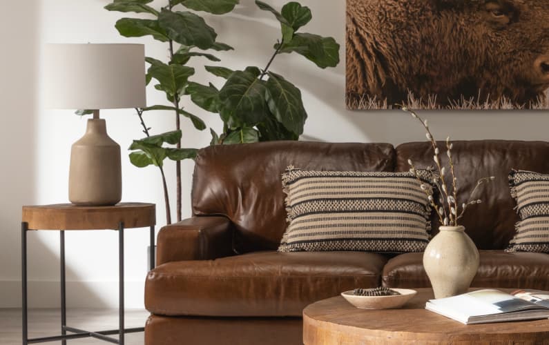
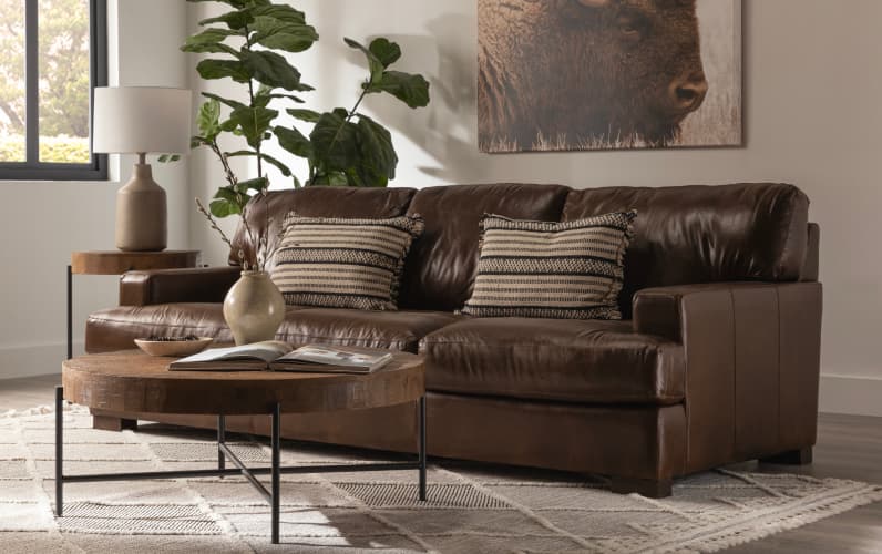
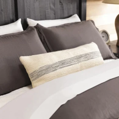
Taupe + Latte Fall Color Scheme
Warm shades of brown comfort. They wrap themselves around you like a hug, filling your soul with the feeling that everything is actually going to be okay. Soft, quiet and natural, this palette doesn’t overreach, but instead grounds.
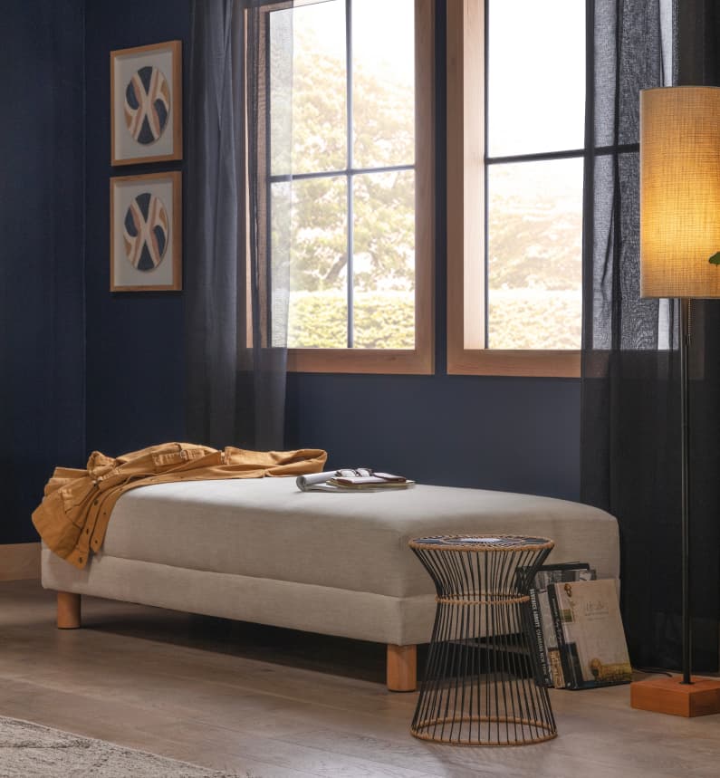
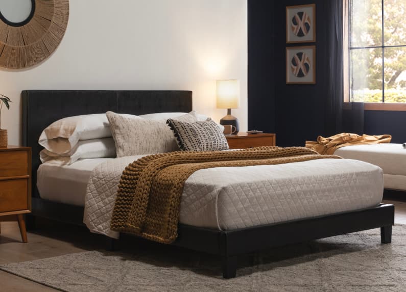
Deep Blue + Ochre Fall Palette
Deep in an autumn forest, a fairytale flower known as the Gentian blooms. In the early hours of the morn, it bathes in dew; amid the weak light of dawn it appears almost black, but as the sun makes her entrance one can see Gentian’s deep, velvety blue. Not so bright that it feels too naïve for the gloomy fall rains to come, it’s the kind of color perfect for the harvest season, especially when soil unearths – and the mustard-yellow of ochre peeps through its roots to provide sweet contrast.
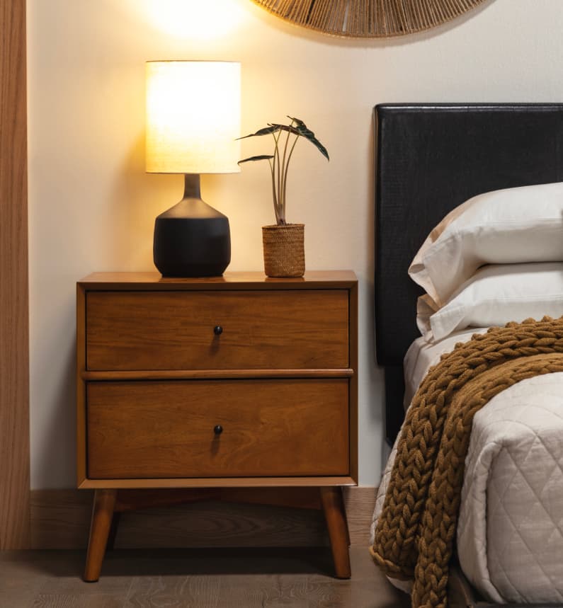




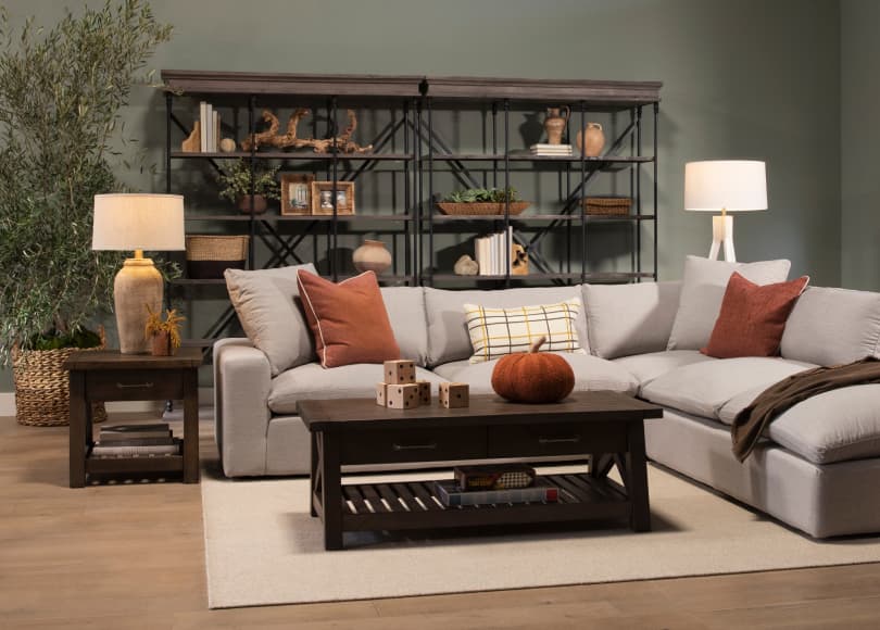
Dark Green + Pumpkin Spice Autumn Color Palette
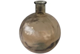
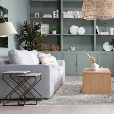
Dark green shades – such as sage, evergreen and avocado, emit earthy vibes and add instant warmth. Green is associated with nurture, and with the fall season all about holidays, gathering and good food, pairing it with a hue as appetite-stirring as orange (butternut squash! sweet potato! pumpkin puree! – what’s more savory than orange foods?) will add the perfect amount of cozy.
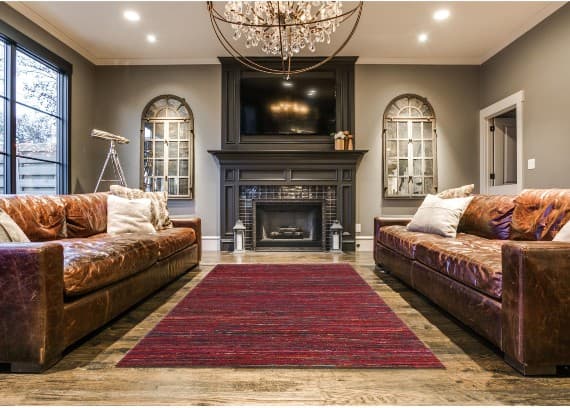
Burnt Orange + Mauve Combo
The lighter side of fall color palettes, burnt orange and mauve makes the perfect pairing for hot-climate homes. Regions where the temps rarely drop below 70 can still bring in the sweater-weather vibes; a versatile layering of lighter shades of orange and purple feel fit for the season – without adding in stuffiness.
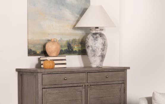
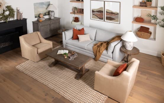
Fall Foliage Color Inspiration
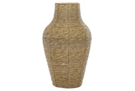
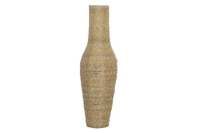
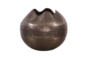
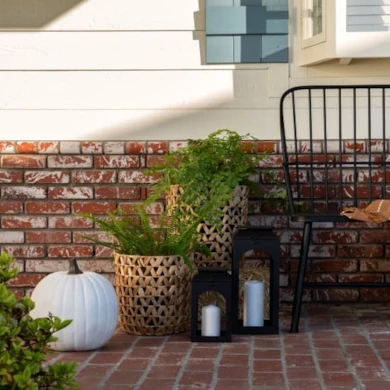
While its reds, oranges and pinks are often romanticized, fall foliage contains other colors like grey, beige and brown – and bringing them into your home can feel just as cozy. For a classic fall vibe, keep the neutrals low to let the textures jump out: fabrics, woods, metals and plants add dimension.






Read the Latest


Editorial Disclaimer: Articles featuring tips and advice are intended for educational purposes and only as general recommendations. Always practice personal discretion when using and caring for furniture, decor and related items.